Case Study: Louie Oliver’s Bottle Wall (Webinar)
From Concept to Reality
Watch this presentation as our lead designers, Ken Lay and Jack Hulme, delve into an intriguing case study of turning a concept into reality. Get inspired for your next project and learn about the challenges and insights Gable found through the creation of this unique project made of illuminated glass bottles.
Partners: Wilmorite Management Group, LLC | Steelman Partners LLP | SunDial Powder Coatings | United Sign Systems
Transcript
Ken Lay
The project was for Harrah’s Northern California. We did a Louis Oliver restaurant bottle wall here. And I’m going to let Jack take us through kind of the initial overview and outline of the presentation.
Jack Hulme
So, part of the overall strategy to this also is Gable has been doing design work for a long time. And more recently, in the last few years or so has been, you know, with Ken and I are getting on board, sort of trying to make their design group there a little more robust. And, again, that goes towards the focus of putting together the presentation. So, in terms of the design studio, we’re focusing on strategy, wayfinding, and experience graphic design, branded environment placemaking, which I think this project falls well into, as well as digital experience and content development.
For this presentation, we’re going to go through basically an architectural process. And I think what’s great about it is that my background is working with architects, Ken’s background is in the retail end working directly with architects. So, we understand the process, and Gable has kind of taken it and molded it into what we do with the built environment, and with architects and designers. So, we’ll go through a couple of quick slides on just who was involved in the project, and the schedule of the project.
We will talk a little bit about the conceptual design portion of it and kind of how it started, what we were provided from the owner, and kind of how we did some feasibility studies of that. And then take that into more of a robust design development phase and really looking at the materials, testing some rapid prototyping downstairs in our shop here at Gable, and coordination with the different trades on site, generating shop drawings and samples down to the actual installation on site. So, for the project engagement, Ken’s got a screen here that shows kind of a graphic of the wall in the background, we’re going to talk a little bit about the project team and the key roles.
Ken Lay
Yeah, so the Louis Oliver’s Bottle Wall for Harrah’s is a pretty good example of how we partnered with the owner and assigned firm to come up with, you know, a pretty great solution. We worked with Wilmer Rights Construction, who is the owner’s rep, for Harrah’s, obviously our internal design studio, and then we worked with Steelman partners and some of their interior designers to review the overall sign package in addition to the bottle wall specifically, and kind of coordinate and, you know, integrate with their initial design, which was kind of a mid-century modern, Northern California approach to the building, and the interiors. And we developed the sign package in addition to the bottle wall to really showcase that and integrate with that well.
And with the bottle wall, specifically, we partnered with a couple of powder coating firms, one locally, Metro Powder Coating, and the final one was out in California because they could handle the capacity of the job. We had like 2300 different bottles to put into the wall we ended up working through how to get the colors right, and how to get the colors we wanted so we ended up learning how to powder coat glass throughout the process and finding someone who could do that for us. And then the fabrication and PM team really took the project, and from the design standpoint, design development CDs, put that at the shop drawings, got it in the shop. We worked with them very closely to figure out how to, you know, lock the bottles into the wall and make something that was easy to replace in the future. And then we partnered with United Sign Systems for a local installer to get everything wrapped up and built in the field for us.
So, schedule. Just a quick schedule. Phases are typical phases. We had some early exploration, material research, a kind of concept design which was about 20% of the schedule. The bulk of the design for us is really in the design development phase; refining materials, coordinating with the site, putting blocking drawings together, doing shop drawings and samples at the end of that, and then the beginning of the procurement and custom fabrication process. And the pattern development and really finalizing the jars really came in kind of that overlap zone between design development and implementation where we created a prototype, figured a couple of things out with the shop, and then got it all coordinated, procured, and out to the field for on-time install.

Jack Hulme
So, I’m going to talk a little bit about the first phase, conceptual design if you want to go ahead there Ken. Really, so that’s kind of the background of the project, the team members, the schedule, but let’s get into like the visuals of it now. So, what we were provided from the owner is what you see on screen here, which was really kind of an architectural conceptual idea in elevation. So, we had the context of the entrance to the restaurant with this large feature wall that spanned across the front of it on multiple panels. And this image on the lower right, which was their precedent image of what they were looking to achieve in terms of in an aesthetic, so we call it the napkin sketch kind of idea that generated the project. But this is kind of our stepping-off point.
From there, in-house, we went and sat down with our manufacturing team and just really did some quick feasibility studies of you know, how can we really create a wall? What could the materials be? How would it get integrated into the wall? What’s the weight of it? What’s the potential weight of it? Energy usage? If we’ve got to access it down the road for any kind of reason that’s built in, that we’re not deconstructing all of these glass bottles in a casino floor, that maybe we can make it in such a way that components are really easy to access without really having to affect the installation and the permanency of the glass into the panel. So just some quick ideas. And then from there, we feel like okay, I think we understand where we’re going to head with this. Where do we find out about glass and colored glass and that whole world?
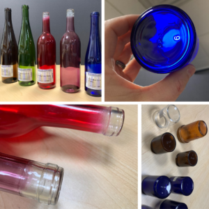
So, we then went out and reached out to some different vendors that provided glass bottles and ordered some samples. From the samples, we then learned about some glass. And generally, a lot of this goes to winemaking, manufacturing. You’ve got your standard green bottles, and clear bottles, and a couple blues. But then there’s this other world of powder coating glass for custom bottles. And that gave us a lot more, we felt that that would give us the control we needed on the light coming through to get the right colors that we wanted to and really kind of felt like the right way to go. We were able to get samples of a blue in multiple densities, so we can look at how the light comes through it at 20% or 30% blue. Just real quick kind of conceptual researched. And then that really gave us a pretty good sense that, okay, we’re pretty sure we can build this. It can be on the wall in a safe way. And we can source the materials to execute this on schedule. So that brought us into the design development phase.
Ken Lay
And, you know, to add to that, with the material research, we originally thought, oh, well, we’ll source wine bottles and get them cut somehow. And then it was a question of how would we get those cut and extrapolating that to the number of bottles or jars we would actually need to create this. Like, how would we actually get that done? So, in the process of ordering some wine bottle samples, we got some ones that were, you know, the brown, the amber, the green, the blue, those all came in stock glass colors. But then we happen to get like a red and a purple one. And what we noticed when we saw closer was that, oh, these were really clear bottles that were, you know, coated somehow. And we eventually did more research and realized you can powder coat glass which I had never personally experienced before. I mean, usually it’s metal or some kind of MDF, etc. So, when we realized that, we started contacting powder coaters to really work through that and see what was possible.
In the in the upper middle here, that was an amber sample from Metro Powder Coating, which is a local powder coater here in Maryland. And they just did a quick test for us, so we kind of realized it would be viable. So, we kind of went with that direction, because then we wouldn’t have to cut glass. We could order jars that were the right size and the right diameter to meet the design intent. And really get those colored, and ordered, and sized appropriately to meet the design criteria.
Jack Hulme
So, in the design development phase, as Ken mentioned, his team worked locally with Metro Powder Coating, which was able to do some pretty quick samples to kind of dial it in but you know, quickly realized that from a capacity standpoint, they just weren’t really the right fit for the project. So, then he began working with the company out of California who really specializes in large run glass bottle powder coating, mostly in cosmetic industries, that that kind of source. Did you want to add to that one?
Ken Lay
Yeah. And what you see here are a couple samples from Steelman. So, they had some glass samples that were part of, you know, the interior design of a restaurant and kind of a different screen that they were working on. So, we kind of looked at those of the initial colors. We had different jar sizes, we were pulling stock powder coats we could use and kind of trying to figure that out. So, we had a rough pattern like you can see in the progress sketch. We hadn’t quite nailed down colors and the overall pattern yet. So for the pattern development, we took our initial concept sketches, some of the mid-century looks, we kind of saw and really narrowed it down to being kind of amber, green, clear and blue. Seemed to be the right mix of colors for the whole elevation.
So, towards the end of design development, beginning of the prototyping, we finally gotten, you know, the final Louie Oliver’s logo from the owner, we started laying out density sizes, whether it’s a random pattern, how we would incorporate the waves, whether it’s stronger or more random. After studying it a lot and trying to like, basically lay out the jars in certain colors… this one looks kind of too striated, a little too sedimentary. We were looking at the bottle spacing, we were really trying to consider, you know, the aesthetics, the overall weight, the amount of jars we would have to either support or order. So, you know, subtle spacing differences really increased or decreased the jar spacing. And we would do full pattern mockups, just print it out, just to kind of test that spacing. Even though, at a small scale, it looks like there’s not a lot of difference. So, we worked through, you know, random patterns, the wave pattern, how to introduce that wave into the overall composition. And then we started dropping the logo back in and reworking it a bit, because the print logo wasn’t quite strong enough for the restaurant and bar. So we made some modifications there. And then did some color studies for the actual sign itself within the brand colors and to make it integrate with the architectural environment. And then the final pattern, where we ended up having the 2300-some-odd jars of two different sizes, we ended up going with two sizes to give a little variation, and then the four colors. So we have the amber, the green, clear, and the blue-kind-of-indigo color. And that’s where we ended up in terms of pattern.

Jack Hulme
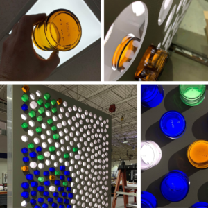
So the really great about being in the shop or above the shop working is that when we get to a point, we can go downstairs and talk to the router technicians and we can start to work with them in real-time to develop some samples and prototypes, not a full size, you know, but little partial samples just enough to start to, you know, again further kind of defined the design. So, we met with the technicians, we talked about how deep the glass should be in the in the face of the sign. So, you get to try to control the bleed of the light on the edges. How we could mount them, whether we could create a method for them to screw in on the back sides for you know, make the installation a lot easier and cleaner. And just different patterns for mounting the glass in for sampling of the of the spacing that we had arrived at. We then took that and created a kind of partial sample in the shop, added some lighting on it to really kind of again, study the densities of the different paint samples and see how those played out with the design intent. Was the green matching the green with the LED spacing off the back? Were we getting the right colors that we wanted to? Did we have to kind of adjust the coloring of the glass or remove the lighting or put in less lighting or more lighting? So, we’re able to kind of like swap those components out with the sample that we made in the shop to really get us really dialed in, know that we are going to meet the expectations in the field. And that when we get out there, the installation is going to go smooth because we’ve already kind of, you know, essentially worked out how it’s how it’s going to happen in the field. And then from there, during that phase, we were also pretty heavily involved with just site coordination, making sure that the contractor is getting the blocking in place for the structure, support the weight that we’re getting the access panels on the backside, provide it for all the wiring that we would need, understanding power requirements, getting those feeds kind of put in place at all in anticipation of the scheduling of the install. And then from there, at that point also, now that we had a good sense that the spacing worked, the weight of the structure was going to work on-site.
We knew the materials. We knew that construction. Our technical team then went to work on a full set of buildable shop drawings. Ken will just kind of just run through a series of probably 10 or so pages, but you can see we’ve got the framing components for the structures with the cabinets, the access panels on the back sides, the blocking details shown there with some of the wood blocking that that was required. Again, more cabinet details.
Ken Lay
And we were really trying to, you know, incorporate the existing rough opening, create some seams for the doors so they would work and be operable in the future and relatively easy to open. It would make them accessible, needing to swap out LEDs and so forth in the future.
Jack Hulme
Yep. Here you can see again, the cabinet details with the bottles, showing a detail of the bottles assembly, and the diffuser for the LED lights, some additional cabinet details. The next slide has the hinge that Ken mentioned. So basically, there‘s a piano hinge more or less across the top, the lower portion swings out, there’s a bar that‘s internal that can be pulled out to support it, keep it open, if a technician or anyone has to, you know, access this for any reason.
Ken Lay
Yeah, and that’s basically the hinge problem for lack of a better term, kind of self–storing within the frame so they don’t lose any of those parts and get misplaced on-site.
Jack Hulme
And then all the way down to the pattern for the actual panels, which was really interesting. What we’re able to do is take the layout on the left-hand side. This is more for like a router kind of efficiency standpoint. And we more or less took the artwork and were able to rotate it in a various directions, whether it was a horizontal flip or a 180 rotation, but kind of utilize that same master template but just kind of flip it around to create the variety of the pattern across the whole wall. And then also everything required for the lighting, the wiring diagrams for permitting, the LEDs placements, so in count the modules, and some of the extrusion components that were used.
Ken Lay
We ended up using off–the–shelf sign cabinet extrusion, but then we would kind of modify those to allow for the hinge door and adjust those slightly to end up with a final product. And this was a preliminary glass jar. This was the original idea. We were still working on how to thread these into the CNC frame. We kind of thought that we would have to do some, you know, textured silicone sealant in there to get it tight. But in the end, when we developed the threaded piece, we realized we could kind of silicone the threads before it screwed into the frame. And you know, this slight gap we could just leave loose, and it ended up looking good in the prototype and made the install much easier. So, if we ever need to change out the jars in the future, hinge the door open, kind of slice the silicone that kind of holds it within the red receptor, and then pop it out.
Jack Hulme
Ken, if you want to go through some of the final control samples during the implementation.
Ken Lay
Sure. So, procurement, custom fabrication. These were some initial kinds of cosmetics in our samples that a company we were working with sent us. Just as like, oh, here’s the blues and greens we’ve got that we’ve done recently. We sent them to wine bottles, which were a good control sample for the blue and the green. They did a color match to those for us. And then the amber and the clear we were able to find. Obviously, clear is off the shelf, and that’s without a powder coat. And the amber one, that was an off the shelf whole class color as well. So, this was the approved pattern kind of wave sketch coming through that we were building the pattern on. And then the pre-approved colors that we’ve developed with the powder coater and in partnership with Steelman’s team. And then this is really just to get the procurement team between the small and the large. We have to kind of do some calculations obviously with overages to order the correct amount of small and large bottles. Or, we call them bottles. They were actually, you know, apothecary jars. Work that out, get those procured, and off to the fabricator for metal powder coating.
Jack Hulme
So on site, these are some images of the install. So, you could see the hinge in operation on the right-hand image there. And basically, we’ve supplied the install crew with full–size color prints that they then were able to overlay over each of the panels, and then that was their template for picking and basically, you know, it’s kind of like a giant light bright set for them to pick and choose and get the right colors in place. So, these are just some progress images of that. And then you can see with the lighting on, how it starts to really take shape in the specific location there.
Ken Lay
Throughout the process, you know, we did have some challenges as there are with any project. There were some logistics issues from the powder coater to the field that they ended up working out. We had some density issues with the powder coat that we worked through. But in the end, they were able to get everything shipped there and off into place for the grand opening.
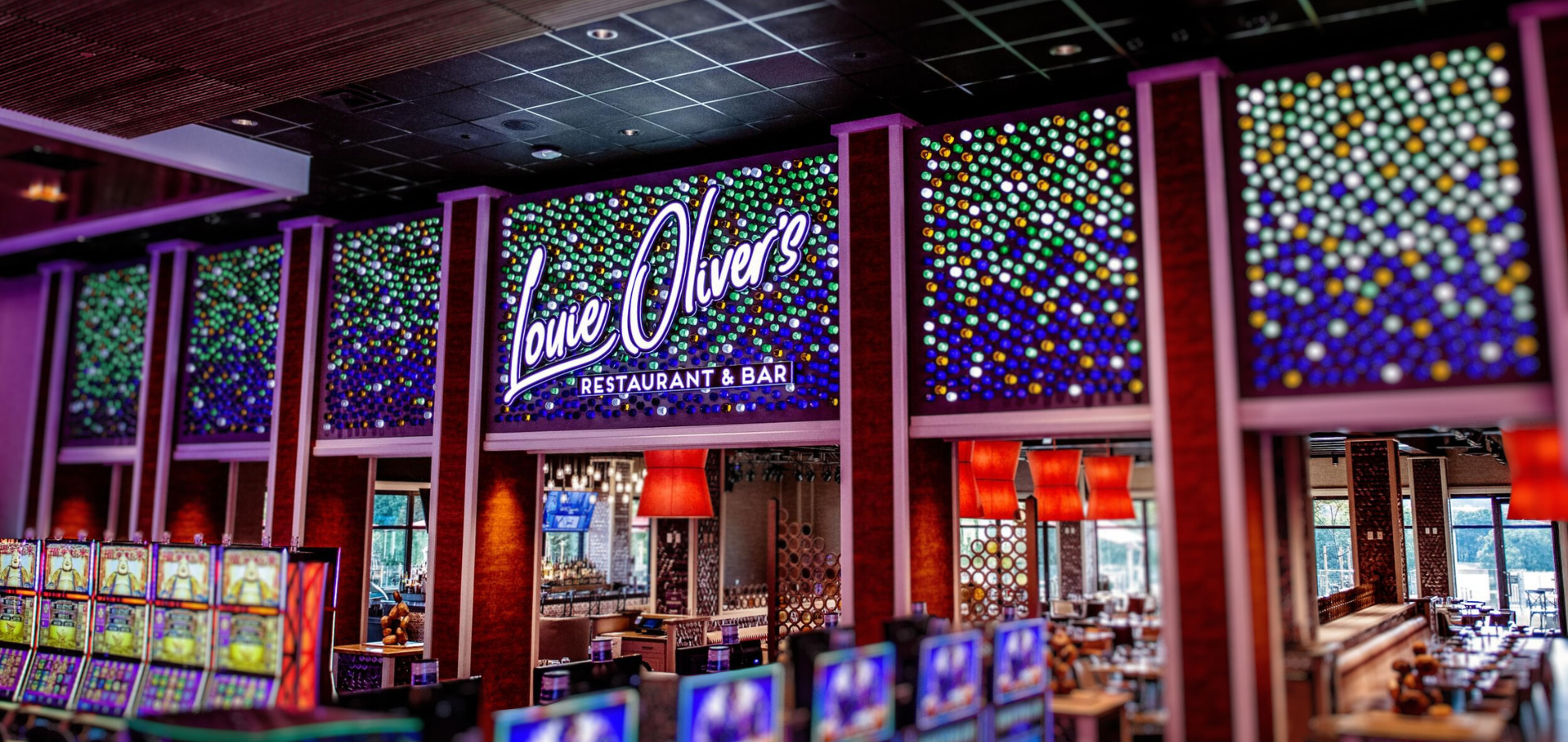
And then this is the finished Louis Oliver sign. You can see the bottles or jars kind of put into place on the Louie Oliver sign mounted over the middle section. And these were kind of the coordinate glass samples in that architectural screen that’s just within the portal, and that’s the hostess area, that coordinated with. And we wanted a little bit stronger color for facing the casino floor but kind of a little bit more sophisticated laid down version of that within the restaurant space itself.
Jack Hulme
And you can see the details there a little bit closer. So that is the story of the bottle wall, and we appreciate everyone’s time listening to us talk for the last half–hour or so. We would be happy to field any questions that you might have about the project.
Speakers
 Ken Lay
Director of Creative Design
 Jack Hulme
Creative Director of Environmental Graphic Design

